Color Psychology in Small Spaces: Choosing the Right Palette
Color psychology is a fascinating field that explores the impact of colors on human emotions and behaviors. In small spaces, color choice becomes even more critical as it can influence both the perception of space and the mood of the inhabitants.
When considering painting or decorating smaller areas like apartments, studios, or compact offices, selecting the right color palette can significantly enhance a feeling of openness, warmth, and tranquility. Understanding which colors work best in confined spaces can help create environments that not only look great but also feel larger and more inviting.
The Importance of Color Psychology in Interior Design
The psychology of color plays a pivotal role in interior design. Colors affect mood, convey emotions, and can even impact the perceived temperature of a room. For small spaces, this becomes doubly important. Choosing the wrong colors might make a space feel cramped or even uncomfortable, while the right colors could make it feel cozy and expansive.
Modern interior design often leverages color psychology to create atmospheres that are conducive to relaxation, productivity, or creativity depending on the space’s purpose. For instance, cooler colors like blues and greens are known to have calming effects, making them ideal for bedrooms and bathrooms, whereas warm hues like reds and oranges can invigorate and energize, perfect for kitchens and living rooms.
In small spaces where every square inch counts, utilizing color effectively can help achieve a balanced, aesthetically pleasing environment. Whether through paint, furniture, or decor, understanding the psychological impact of each hue can assist in maximizing both beauty and functionality.
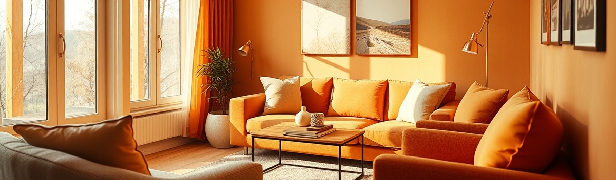
Warm Tones for Cozy and Inviting Spaces
Warm tones, such as yellows, oranges, and reds, bring a sense of coziness and warmth to any space. In small spaces, these colors can create a comforting atmosphere, making them feel homely and inviting.
While strong, bright colors can be overwhelming in confined spaces, opting for more muted shades or using bold colors sparingly creates visual interest without overpowering the room. For instance, an orange accent wall or yellow cushions can infuse warmth without making the room feel too closed-in.
Strategically placing warm tones in areas of natural light can further enhance their effect, as sunlight can deepen and enrich these hues. This technique is particularly effective in living rooms or dining areas where social interaction is prioritized.
Natural Greens and Calming Blues
Nature-inspired colors such as greens and blues are tied to feelings of tranquility and peace, reflecting the natural world’s serenity. These colors are particularly effective in small spaces due to their ability to make areas feel restful and expansive.
Light blues, reminiscent of the sky and sea, can make rooms appear bigger by giving them an airy feel, ideal for bathrooms and bedrooms. Warmer greens can bring a touch of nature inside, providing a soothing atmosphere that encourages rest and relaxation.
Utilizing plants and green accents can enhance the calming effect of these colors, connecting indoor spaces with the rejuvenating spirit of the outdoors and bringing a fresh, breathable feel to cramped quarters.
Subtle Use of Vibrant Accents
While it might be tempting to keep small spaces neutral, incorporating vivid accents can bring them to life and express personality. The key is balance; using vibrancy in moderation prevents overwhelming a small room.
Vivid hues like royal blue, vivid pink, or bold yellow can serve as striking focal points if used in the right doses, through art pieces, furniture, or even a bright feature wall. The result can transform small, monotonous spaces into lively, engaging environments.
This technique allows inhabitants to experience the benefits of bright, happy colors without compromising the openness of a small space, achieving both personal expression and spatial harmony.
Effective Color Schemes for Small Spaces
Creating a cohesive color scheme in small spaces involves careful deliberation of contrasts, complements, and the overall atmosphere you wish to create. A harmonious mix of soft neutrals with bold accents can open up a space significantly.
For instance, combining a soft gray with pops of bright orange or navy can create both contrast and depth, making the room feel larger while still dynamic. The trick lies in maintaining a dominant neutral tone that anchors the space, allowing accent colors to highlight and expand the overall visual effect.
In open-plan areas or multi-use spaces, maintaining a consistent palette throughout can ensure fluidity and simplicity, making transitions between areas seamless and visually comfortable.
Conclusion: Choosing Colors that Transform
Choosing the right colors for small spaces is more than just a stylistic decision – it’s about transforming how these spaces work for you emotionally and functionally. The right combination of colors can foster a feeling of happiness, focus, and well-being, even in the most confined quarters.
Exploring the intricate effects of color psychology allows for more deliberate choices that truly reflect the intended use and ambiance of a space. Understanding how different hues impact mood can be an invaluable tool in crafting interiors that are both beautiful and beneficial to everyday life.
A dynamic interplay of various shades can result in spaces that do not just support daily activities but elevate them, creating a holistic environment where people genuinely feel more connected and at ease. In essence, the right color palette brings out the best in both the space and the people who inhabit it.